

A fully customizable, accessible one-time password input for React.


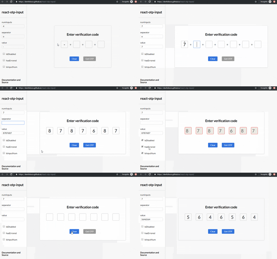
- Tiny, zero dependencies: only
reactas a peer dependency. - Paste anywhere: paste from the long-press menu, Ctrl/⌘+V or the mobile keyboard clipboard suggestion, from any input.
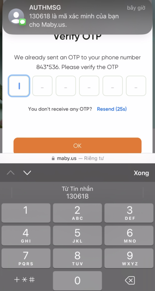
- SMS autofill: every input uses
autocomplete="one-time-code", so iOS and Android suggest the code from SMS. - Keyboard friendly: Backspace, Delete, ← / → navigation.
- Numeric mode that filters out non-digits and opens the numeric keypad on mobile.
- Styling your way: every style prop accepts a style object or a class name.
- Accessible: each input has a descriptive
aria-label. - TypeScript types included.
pnpm add reactjs-otp-input
# or
npm install reactjs-otp-input
# or
yarn add reactjs-otp-input
Requires react and react-dom 17 or newer.
import { useState } from 'react';
import { OtpInput } from 'reactjs-otp-input';

export const App = () => {
  const [otp, setOtp] = useState('');

  return <OtpInput value={otp} onChange={setOtp} numInputs={6} separator={<span>-</span>} />;
};<OtpInput value={otp} onChange={setOtp} numInputs={4} isInputNum placeholder="0000" /><OtpInput value={otp} onChange={setOtp} numInputs={4} isInputSecure /><OtpInput value={otp} onChange={setOtp} numInputs={4} hasErrored={isWrongCode} errorStyle="otp--error" />Each *Style prop takes either a style object or a class name. Focus, disabled and error styles are merged on top of inputStyle.
// Style objects
<OtpInput
  value={otp}
  onChange={setOtp}
  numInputs={6}
  containerStyle={{ gap: 8 }}
  inputStyle={{ width: 48, height: 56, fontSize: 24, borderRadius: 8, border: '1px solid #ccc' }}
  focusStyle={{ borderColor: '#6d5dfc', outline: 'none' }}
  errorStyle={{ borderColor: 'red' }}
/>

// Class names
<OtpInput
  value={otp}
  onChange={setOtp}
  numInputs={6}
  containerStyle="otp-container"
  inputStyle="otp-input"
  focusStyle="otp-input--focus"
  errorStyle="otp-input--error"
/>
Each input has an inline default
width: 1em. When sizing with a class name, use!importantforwidth(or passinputStyleas an object).
import { useRef, useState } from 'react';
import { OtpInput, OtpInputHandle } from 'reactjs-otp-input';

export const App = () => {
  const [otp, setOtp] = useState('');
  const ref = useRef<OtpInputHandle>(null);

  return (
    <>
      <OtpInput ref={ref} value={otp} onChange={setOtp} numInputs={6} />
      <button
        onClick={() => {
          setOtp('');
          ref.current?.focusInput(0);
        }}
      >
        Reset
      </button>
    </>
  );
};| Method | Description |
|---|---|
focusInput(index) |
Focuses (and selects) the input at index (clamped). |
- A complete code (at least
numInputsvalid characters) always fills every input from the first one, whichever input is focused. - A shorter text fills from the focused input onwards.
- Characters that are not allowed (spaces, dashes, and letters when
isInputNumis set) are skipped, so"Code: 482-913"becomes482913. - After pasting, focus moves to the next empty input (or the last one).
| Key | Action |
|---|---|
| Backspace | Clears the current input, or the previous one if the current is empty, and moves back |
| Delete | Clears the current input |
| ← / → | Moves to the previous / next input |
| Space | Ignored |
| Name | Type | Required | Default | Description |
|---|---|---|---|---|
onChange |
(otp: string) => void |
✅ | — | Called with the full OTP string every time it changes. |
value |
string | number |
'' |
The value of the OTP (controlled). | |
numInputs |
number |
4 |
Number of inputs to render. | |
placeholder |
string |
— | One character per input. Its length must equal numInputs. |
|
separator |
ReactNode |
— | Rendered between each pair of inputs, e.g. <span>-</span>. |
|
containerStyle |
CSSProperties | string |
— | Style object or class name for the container. | |
inputStyle |
CSSProperties | string |
— | Style object or class name for every input. | |
focusStyle |
CSSProperties | string |
— | Applied to the focused input. | |
isDisabled |
boolean |
false |
Disables all inputs. | |
disabledStyle |
CSSProperties | string |
— | Applied to inputs when disabled. | |
hasErrored |
boolean |
false |
Marks the inputs as errored. | |
errorStyle |
CSSProperties | string |
— | Applied to inputs when hasErrored is true. |
|
shouldAutoFocus |
boolean |
false |
Focuses the first input on mount. | |
isInputNum |
boolean |
false |
Only accepts digits and shows the numeric keypad on mobile. | |
isInputSecure |
boolean |
false |
Masks the characters (type="password"). |
|
className |
string |
— | Class name for the wrapper div of each input. |
|
data-cy |
string |
— | Test attribute, set on each input as ${data-cy}-${index}. |
|
data-testid |
string |
— | Test attribute, set on each input as ${data-testid}-${index}. |
import type { OtpInputProps, OtpInputHandle } from 'reactjs-otp-input';The docs folder is a Vite + React app with a documentation page and an interactive playground. It imports the library straight from src, so changes show up instantly.
pnpm install
pnpm docs:dev       # start the docs locally (add --host to open it on your phone)
pnpm docs:build     # build the static site into docs/dist
pnpm docs:preview # preview the production buildpnpm install
pnpm build # build the library into dist/
pnpm typecheck # type-check the source
pnpm lint # lintCommit messages follow the commit convention.

Gia Hung – hung.hg